Illegible Fonts!
44 posts
• Page 4 of 5 • 1, 2, 3, 4, 5
Re: Illegible Fonts!
![]() by Orocnogu » Mon Aug 31, 2015 10:03 pm
by Orocnogu » Mon Aug 31, 2015 10:03 pm
Although I've learned that in-your-face attitude is somehow considered not only acceptable, but "quirky" and overall beneficial for the game's management, I strongly agree that the font for skills and stats MUST be changed. Yes, it may be "cultural" (huh? cyrillic first language here) to see those unreadable first letters, say, at the start of a very long page of in-game lore or even some flavour texts you put into the skill description panel. But when you struggle to read every single word in the "stats" page... I realize these fonts, minimap and camera rotation issues, "hiccups" in the ingame music and ambience sounds -- those are all minor inconveniences, and "that's why you support custom clients", but those issues still should be addressed by developers, not proclaimed "a feature put there just 'cause it's silly". I don't know, do you guys even want the game to have a satisfied customers' community?
- Orocnogu
- Posts: 42
- Joined: Fri Sep 12, 2014 9:37 pm
- prozhong
- Posts: 39
- Joined: Tue Apr 02, 2013 5:44 am
Re: Illegible Fonts!
![]() by Kronicstrafe » Tue Sep 01, 2015 8:02 pm
by Kronicstrafe » Tue Sep 01, 2015 8:02 pm
jaguar wrote:Hello, please fix ingame fonts, they are unreadable.
Who is agree, please support me, post there.
Font is very irritating especially on 1440p. I can feel my eye sight getting worse by the second.
- Kronicstrafe
- Posts: 35
- Joined: Fri Jul 12, 2013 6:54 pm
Re: Illegible Fonts!
![]() by Kronicstrafe » Tue Sep 01, 2015 8:03 pm
by Kronicstrafe » Tue Sep 01, 2015 8:03 pm
Orocnogu wrote:Although I've learned that in-your-face attitude is somehow considered not only acceptable, but "quirky" and overall beneficial for the game's management, I strongly agree that the font for skills and stats MUST be changed. Yes, it may be "cultural" (huh? cyrillic first language here) to see those unreadable first letters, say, at the start of a very long page of in-game lore or even some flavour texts you put into the skill description panel. But when you struggle to read every single word in the "stats" page... I realize these fonts, minimap and camera rotation issues, "hiccups" in the ingame music and ambience sounds -- those are all minor inconveniences, and "that's why you support custom clients", but those issues still should be addressed by developers, not proclaimed "a feature put there just 'cause it's silly". I don't know, do you guys even want the game to have a satisfied customers' community?
^ yup. One of the many reasons i will not pay subscription.
- Kronicstrafe
- Posts: 35
- Joined: Fri Jul 12, 2013 6:54 pm
Re: Illegible Fonts!
![]() by ApocalypsePlease » Tue Sep 01, 2015 8:06 pm
by ApocalypsePlease » Tue Sep 01, 2015 8:06 pm
I mean the end result is that if you don't do this Jorb/Loftar, the custom clients will. Same deal with non-persistent names above other peoples' heads
Inactive
-

ApocalypsePlease - Posts: 1164
- Joined: Mon Jun 27, 2011 12:52 am
Re: Illegible Fonts!
![]() by Ants » Tue Sep 01, 2015 9:07 pm
by Ants » Tue Sep 01, 2015 9:07 pm
jorb wrote:MrBober wrote:It's always nice to see the attitude "I like that font, so fuck you all if you don't. It's a great font, and I don't give a fuck if you can't read it".
It really gets your hopes up for changes in the "important" stuff!
It's always nice to engage with people with a well developed sense of humor, who take the small things in life with the gravity they merit.
I would not be opposed to perhaps add an option to switch it, but I intend to keep it as a default setting. It is a more beautiful and, indeed, cultured, typeface, and I have no problems what so ever reading it. I have a problem reading all the Latin newfaggotry that is so ubiquitous in the modern era.
We support custom clients for a reason. Even though this particular stance of mine is, indeed, one of maintaining a principle for the sake of being silly, it is nevertheless the case that one size will never fit all in terms of how to best display and render information.
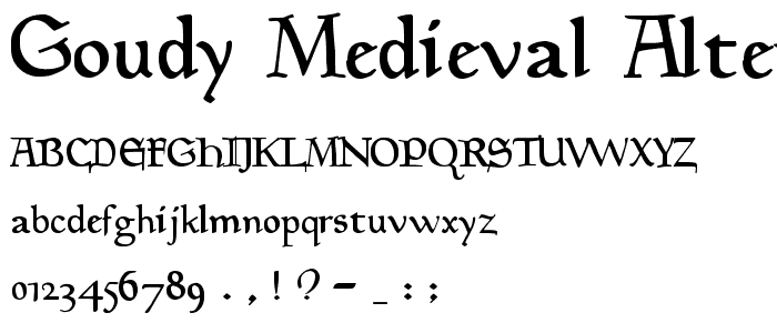
Maybe a tweaked version of that font would work? As it is it really is hard to read. These seem a little more legible:
http://www.designyourway.net/drb/ths/di ... Gothic.jpg
http://www.pickafont.com/images/fonts/l ... te.ttf.png
❤Haven's most kawaii retarded ethot karen❤

-

Ants - Posts: 1842
- Joined: Sun May 04, 2014 9:55 pm
- Location: inside your head
-

Orcling - Posts: 585
- Joined: Thu Mar 15, 2012 3:44 am
Re: Illegible Fonts!
![]() by GenghisKhan44 » Wed Sep 02, 2015 4:33 am
by GenghisKhan44 » Wed Sep 02, 2015 4:33 am
An_Infinity_of_War wrote:GenghisKhan44 wrote:muh eyes
What is wrong with Fraktur? It is easier to read than most other fonts.
Besides, all the ones you listed have no character about them. They were designed to be easily read; not enjoyed for what they represent.

"...the dungeon and shackles are already at my threshold to show me here and now my eternal disgrace. Only you can work the miracle to make life possible for a soul so imperiled by doubt, O Atoner for all, exalted beyond saying." - St. Gregory of Narek, Book of Lamentations, Prayer 1.
You are much loved! Love in return!
You are much loved! Love in return!
-

GenghisKhan44 - Posts: 969
- Joined: Sat Feb 18, 2012 4:56 pm
Re: Illegible Fonts!
![]() by Vigilance » Wed Sep 02, 2015 7:31 am
by Vigilance » Wed Sep 02, 2015 7:31 am
HarryDresden wrote:+1. Really does need a clearer font, it's fucking terrible.
Agree, fuck it.

"Tosak gets the guys undressed faster than their girlfriends can." -NaoWhut
http://i.imgur.com/5cQiL.png http://i.imgur.com/lYyAA.png
-

Vigilance - Posts: 3561
- Joined: Fri May 21, 2010 9:30 pm
- Location: fog of irrelevancy
Re: Illegible Fonts!
![]() by BangPow » Wed Sep 02, 2015 7:35 am
by BangPow » Wed Sep 02, 2015 7:35 am
Vigilance wrote:HarryDresden wrote:+1. Really does need a clearer font, it's fucking terrible.
Agree, fuck it.
What the fuck!?! It's Vigi! he's still alive!
Before enlightenment - chop wood, carry water. After enlightenment - chop wood, carry water. ~Zen Buddhist Proverb
-

BangPow - Posts: 427
- Joined: Tue May 31, 2011 4:15 am
- Location: Now.......... Awakened
44 posts
• Page 4 of 5 • 1, 2, 3, 4, 5
Who is online
Users browsing this forum: Claude [Bot], OIchi and 5 guests

Powered by phpBB © 2000, 2002, 2005, 2007 phpBB Group